Friday, June 14, 2024

WATERCOLOR SPOTLIGHT ON NATURE

Yesterday, in my Learning with Friends (LWF) video I demonstrated the Masking Tape Technique.  I wanted to give it a bit of a Twist so I combined the technique with watercoloring, and I LOVE how this card turned out.


I used all the 2024 - 2026 In-Colors to create the masking tape watercolor background.  These colors all work so beautifully together.  Unlike Wednesday's card, there was no "color-stressing" over this card.

If you missed the LWF video, you can watch the replay below.


This may be my new favorite way to do the masking tape technique.


What do you think about this "off-set" layout?  I used it in one of my recent classes and thought I'd try a little different version of it on today's card.  We are so accustomed to centering our focal points on a mat, but I like this off-set design.  It is new and fresh!


It also provides a wider area on the side and top to showcase a larger view of a pretty embossed area.

Since my bottom stripe of Peach Pie was sort of "overrun" by the Shy Shamrock ink, I thought maybe the Peach Pie Color was feeling a bit left out.  So, I stamped the Butterfly from Spotlight on Nature on Watercolor paper and then used a Water Painter to color her with Peach Pie.  It doesn't show in the photo, but after watercoloring, I also gave her some Wink of Stella.  In real life, she really sparkles! 

Before adhering her to the card front I stamped her upper body and antennae directly on the card front.  That way when I fussy cut her, I didn't need to worry about trimming around her antennae. I just snipped them off.  I also curled her wings a bit with my bone folder before adhering just her body to the card front.


The sentiment on the inside of the card is from the Courage & Faith stamp set.  Ms. Butterfly said she needed to be next to the sentiment because as a butterfly she is a symbol of hope.

You can use this link to download a PDF Tutorial for today's card.  If you decide to try the Watercolor Twist on the Masking Tape Technique, I'd love to know how it went.  How about leaving me a comment?

The products used on today's card are listed below.

Product List

Wednesday, June 12, 2024

MOODY MAUVE SPOTLIGHT ON NATURE

Today's card uses a technique that I don't remember having done before.  I am trying to think outside of the box a bit and try different things.  When coloring with Stampin' Blends, one of my favorite coloring mediums, I usually color on Basic White cardstock or occasionally Very Vanilla.  Today I thought I would try the Stampin' Blends on colored cardstock.


What do you think?  I heat embossed the images from Spotlight on Nature with white embossing powder on Moody Mauve cardstock and then colored them with Stampin' Blends.  I discovered that the alcohol based Stampin' Blends also add some color to the embossed portion of the image and it doesn't easily wipe off.  I ending up really liking this "surprise" particularly on the leaves because then the Granny Apple Green color showed up a bit.


If I tried to keep the green only on the Moody Mauve cardstock and not on the embossed portion of the image, it didn't really look "green".  It just sort of darkened the Moody Mauve cardstock.

What do you think? Even though it was different than I envisioned, I sort of like how it turned out.

This was not a difficult card, but I will admit that it was one that I played around with a lot more than I wanted.  I kept changing the colors of the cardstock layers.  

I started with a Basic Beige card base which looked really pretty in the "pile" on my workspace, one once the card was put together it looked a bit blah.  Then I added the Basic White layer between the Pretty Peacock and the Moody Mauve and that helped brighten it up a bit, but I still wasn't crazy about it.

I finally ended up getting rid of the Basic Beige totally and just going with a Basic White card base, and that gave it more "life".  Am I the only one that struggles with colors?  Sometimes even my Color Coach lets me down.  And this was one of those days!


The sentiment die cut is from the Spotlight on Nature Dies.  I love these circle dies!  There are 3 different designs and several sizes of each which can be layered or left to stand alone.

After I added the Iridescent Faceted Gems on the card front (one was strategically placed to cover up a boo-boo!), it still seemed like it needed something -- so I added the two little ribbon tails under the sentiment.


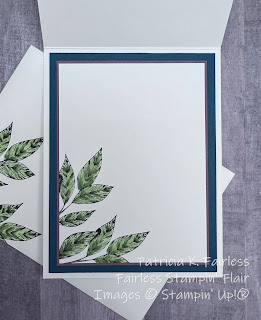
I know this is weird but I'm probably happiest with the inside of the card!  The leaves were stamped with Black Memento and colored with Granny Apple Green Blends.

I'd love to hear what you think of the card.  For an easy card, I sure stressed over this one!

Now that I have it all figured out (I think), you can take advantage of my struggles and just download the FREE Tutorial.   

A list of current products is shown below with links to my Stampin' Up! store if you want more details.

Product List

Monday, June 10, 2024

CAN'T RESIST A SPOTLIGHT ON NATURE

It is a brand new week, and this week I am going to feature one of my favorite new bundles!  It is called SPOTLIGHT ON NATURE.  The circle dies are what first caught my eye with this bundle, but now that I have it, I am loving the stamp images.

If fact, I shocked myself that I didn't use the dies on every card!

Today's card was one of the cards that I used in my Learning with Friends video last week to demonstrate how to do the Waxed Paper Resist Technique.  If you missed the video, you can still watch the replay.


The Waxed Paper Resist Technique has been around for a long time, but it is usually only shown using Glossy cardstock.  I experimented a bit on my video to see if it would work with regular cardstock, and IT DOES!


This card layout is also one of my favorites.  Typically it is in the Portrait Orientation with a circular element, but I decided to mix it up a bit.  It's a great layout to show off designer series paper, and that is why I thought it also worked well to show off the differences in the technique sheets.

The upper rectangle on the card was made using Glossy White cardstock (Yes, I know it is retired, but I stocked up before it retired and still have some in my stash.)  The smaller, lower rectangle was made with regular Basic White cardstock.

One of the fun things about the Waxed Paper Resist Technique is that you make two technique sheets at the same time.  Watch the video to see how.

These two sheets look very different, but both were made the same and at the same time.  In the video I also showed a 3rd technique sheet made from Photo Paper.  Even though all 3 were made with the same technique, the same Coastal Cabana Ink, and the same So Swirly Embossing Folder, they all look quite different.  

The image was die cut with the Thoughtful Expressions Dies.  

If you like this card layout, use this link to download a free tutorial.  It provides all the dimensional information and step-by-step directions -- including a link to the technique video.


As I mentioned above, each time you use the Waxed Paper Resist Technique you make two sheets, so I had plenty of leftovers to decorate both the inside of my card and the flap of my envelope.  Gotta love those leftovers!

For a list of current products that were used please see the list below. 

Remember, all this month you can get an additional 10% off on Die Bundles.  So, if you love the Spotlight on Nature Bundle or the Thoughtful Expressions Bundles, like I do, just click on the images in the Product List below and you will be taken to my Stampin' Up! store.  


Product List